Scratch
archived forums

#52 2011-09-08 17:18:21
- Albertt911
- Scratcher
- Registered: 2010-09-28
- Posts: 1000+
Re: How do you like her?
She looks like a julia  I think she should wave in the first block.
'The only problem with the world is that fools and fanatics are so certain of themselves, and the wise so full of doubt.'


Offline


#56 2011-09-08 17:45:52
- The_Dancing_Donut
- Scratcher
- Registered: 2010-08-03
- Posts: 1000+
Re: How do you like her?
DarkerWorld wrote:
tomicool wrote:
PandaGuy wrote:
Wait, what? o_o
And thanks!Just look at the title, it looks kinda... wrong... either that or I have a dirty mind.
Hopefully its not the dirty mind bit, because then we both need to clean ours.
Same xD I imagine Julia luring little kids into her 'Free Candy' van... ^_^
Cool drawing! Maybe add more expression to the eyes/eyebrows, but overall I like it!
Oh, and I'd suggestb you change the text in your sig. It keeps me awake at night.
Offending strangers since 2010.
Offline
#57 2011-09-08 20:01:29
- littletonkslover
- Scratcher
- Registered: 2008-12-12
- Posts: 1000+
Re: How do you like her?
the facial proportions are off, and the mouth is far too low. the eyebrows are very short and the eyes are oddly shaped
but i like the coloring and the hair. overall a decent drawing. keep practicing kid

That's the dark nature of capitalism. ~ Wonder Showzen
Offline

#59 2011-09-08 20:11:51
Re: How do you like her?
PandaGuy wrote:
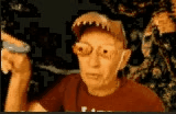
http://i.imgur.com/O5s7R.gif
Give me your honest opinion.
Honestly, not really, but its a start. I remember I used to be horrible at drawing faces and people, but I've gotten better.
Technical Advice: The eyes need to be more realistic. The pupils and iris are actually pretty well done for a computer drawn thing, but the shapes are wonky (her left eye is all squished). The eyebrows should be longer and lower down. The bridge of her nose should go a bit higher.
Another problem with the eyes, is they should be half way down the face. If it looks weird, I suggest making the bangs a bit longer and fuller.
She is seriously lacking eyelashes (Two isn't enough). If you continue using the thicker sized pen, they will look odd, so get the pen size really small, and don't make them too long or squiggly. Make sure they all go at a similar angle too.
Now, the mouth. Make it longer (now I'm not talking frog mouths here) and the tongue is an odd color and is too small. (Again, don't over-do it.). Give her lips too, just a slightly pinkish red line above and below the mouth line. (they can be thick or thin, depending on what you want her to look like)
Also, in the comic strip, her opened mouth looks odd. Perhaps adding the lips would make it better, and not a perfect oval. Try opening and closing your mouth in the mirror. Study the shape it makes. Try drawing those shapes on paper.
The hair is unrealistic, but realistic is really hard on computer-drawn people. Just try adding a few darker lines with a thin pen size. Also add lighter brown lines here and there. Perhaps shading and highlighting the hair would add more realism, but that would mean shading her face would be necessary too. (But that would benefit the drawing too.)
Lastly, about the face shape, is peoples faces are never complete circles. Try making it more oval shaped, with a chin (for females, chins are usually more pointed).
Maybe some more small details would add to the realistic effect. For example, freckles, rosy red cheeks, or even a small blemish.
I also noticed the lack of ears (And nostrils too). Try to include them in later drawings 
Overall, good for being computer-drawn. And if this is your first person drawing, its actually a fantastic start.
Keep it up!
Last edited by wiimaster (2011-09-08 20:18:21)

Offline
#60 2011-09-08 20:46:25
- jji7skyline
- Scratcher
- Registered: 2010-03-08
- Posts: 1000+
Re: How do you like her?
PandaGuy wrote:
jji7skyline wrote:
Creepy?
What software did you use?Scratch.
That's actually pretty good then...
The nose is a bit unrealistic though... and the eyes are a bit too big O_O
I don't know why you say goodbye, I say hello!
Offline

#62 2011-09-08 22:07:04
Re: How do you like her?
wiimaster wrote:
PandaGuy wrote:
http://i.imgur.com/O5s7R.gif
Give me your honest opinion.Honestly, not really, but its a start. I remember I used to be horrible at drawing faces and people, but I've gotten better.
Technical Advice: The eyes need to be more realistic. The pupils and iris are actually pretty well done for a computer drawn thing, but the shapes are wonky (her left eye is all squished). The eyebrows should be longer and lower down. The bridge of her nose should go a bit higher.
Another problem with the eyes, is they should be half way down the face. If it looks weird, I suggest making the bangs a bit longer and fuller.
She is seriously lacking eyelashes (Two isn't enough). If you continue using the thicker sized pen, they will look odd, so get the pen size really small, and don't make them too long or squiggly. Make sure they all go at a similar angle too.
Now, the mouth. Make it longer (now I'm not talking frog mouths here) and the tongue is an odd color and is too small. (Again, don't over-do it.). Give her lips too, just a slightly pinkish red line above and below the mouth line. (they can be thick or thin, depending on what you want her to look like)
Also, in the comic strip, her opened mouth looks odd. Perhaps adding the lips would make it better, and not a perfect oval. Try opening and closing your mouth in the mirror. Study the shape it makes. Try drawing those shapes on paper.
The hair is unrealistic, but realistic is really hard on computer-drawn people. Just try adding a few darker lines with a thin pen size. Also add lighter brown lines here and there. Perhaps shading and highlighting the hair would add more realism, but that would mean shading her face would be necessary too. (But that would benefit the drawing too.)
Lastly, about the face shape, is peoples faces are never complete circles. Try making it more oval shaped, with a chin (for females, chins are usually more pointed).
Maybe some more small details would add to the realistic effect. For example, freckles, rosy red cheeks, or even a small blemish.
I also noticed the lack of ears (And nostrils too). Try to include them in later drawings
Overall, good for being computer-drawn. And if this is your first person drawing, its actually a fantastic start.
Keep it up!
You do know I have my own style of drawing. I happen to like the perfect oval mouth, but sometimes I do add lips, too.
Offline
#63 2011-09-08 22:20:28
Re: How do you like her?

"And soon all the world will be at my knees and a new world order will fall into place.
Through the ashes, there will come a hero, a hero of darkness and despair,
a man whose only goal is to bring Earth into Hell.
But hey, who says we're not already in it?"
-Bad Man
Offline
#65 2011-09-08 22:27:54
Re: How do you like her?
PandaGuy wrote:
wiimaster wrote:
PandaGuy wrote:
http://i.imgur.com/O5s7R.gif
Give me your honest opinion.Honestly, not really, but its a start. I remember I used to be horrible at drawing faces and people, but I've gotten better.
Technical Advice: The eyes need to be more realistic. The pupils and iris are actually pretty well done for a computer drawn thing, but the shapes are wonky (her left eye is all squished). The eyebrows should be longer and lower down. The bridge of her nose should go a bit higher.
Another problem with the eyes, is they should be half way down the face. If it looks weird, I suggest making the bangs a bit longer and fuller.
She is seriously lacking eyelashes (Two isn't enough). If you continue using the thicker sized pen, they will look odd, so get the pen size really small, and don't make them too long or squiggly. Make sure they all go at a similar angle too.
Now, the mouth. Make it longer (now I'm not talking frog mouths here) and the tongue is an odd color and is too small. (Again, don't over-do it.). Give her lips too, just a slightly pinkish red line above and below the mouth line. (they can be thick or thin, depending on what you want her to look like)
Also, in the comic strip, her opened mouth looks odd. Perhaps adding the lips would make it better, and not a perfect oval. Try opening and closing your mouth in the mirror. Study the shape it makes. Try drawing those shapes on paper.
The hair is unrealistic, but realistic is really hard on computer-drawn people. Just try adding a few darker lines with a thin pen size. Also add lighter brown lines here and there. Perhaps shading and highlighting the hair would add more realism, but that would mean shading her face would be necessary too. (But that would benefit the drawing too.)
Lastly, about the face shape, is peoples faces are never complete circles. Try making it more oval shaped, with a chin (for females, chins are usually more pointed).
Maybe some more small details would add to the realistic effect. For example, freckles, rosy red cheeks, or even a small blemish.
I also noticed the lack of ears (And nostrils too). Try to include them in later drawings
Overall, good for being computer-drawn. And if this is your first person drawing, its actually a fantastic start.
Keep it up!You do know I have my own style of drawing. I happen to like the perfect oval mouth, but sometimes I do add lips, too.
I think that it was meant as constructive critisism, not an insult. Maybe you can use some tips to build upon what you have right now? I like the hair idea that wiimaster came up with. I know I am terrible drawing with a mouse. Paper is way easier.

Offline
#66 2011-09-09 14:48:46
Re: How do you like her?
wiimaster wrote:
PandaGuy wrote:
http://i.imgur.com/O5s7R.gif
Give me your honest opinion.Honestly, not really, but its a start. I remember I used to be horrible at drawing faces and people, but I've gotten better.
Technical Advice: The eyes need to be more realistic. The pupils and iris are actually pretty well done for a computer drawn thing, but the shapes are wonky (her left eye is all squished). The eyebrows should be longer and lower down. The bridge of her nose should go a bit higher.
Another problem with the eyes, is they should be half way down the face. If it looks weird, I suggest making the bangs a bit longer and fuller.
She is seriously lacking eyelashes (Two isn't enough). If you continue using the thicker sized pen, they will look odd, so get the pen size really small, and don't make them too long or squiggly. Make sure they all go at a similar angle too.
Now, the mouth. Make it longer (now I'm not talking frog mouths here) and the tongue is an odd color and is too small. (Again, don't over-do it.). Give her lips too, just a slightly pinkish red line above and below the mouth line. (they can be thick or thin, depending on what you want her to look like)
Also, in the comic strip, her opened mouth looks odd. Perhaps adding the lips would make it better, and not a perfect oval. Try opening and closing your mouth in the mirror. Study the shape it makes. Try drawing those shapes on paper.
The hair is unrealistic, but realistic is really hard on computer-drawn people. Just try adding a few darker lines with a thin pen size. Also add lighter brown lines here and there. Perhaps shading and highlighting the hair would add more realism, but that would mean shading her face would be necessary too. (But that would benefit the drawing too.)
Lastly, about the face shape, is peoples faces are never complete circles. Try making it more oval shaped, with a chin (for females, chins are usually more pointed).
Maybe some more small details would add to the realistic effect. For example, freckles, rosy red cheeks, or even a small blemish.
I also noticed the lack of ears (And nostrils too). Try to include them in later drawings
Overall, good for being computer-drawn. And if this is your first person drawing, its actually a fantastic start.
Keep it up!
I appreciate your criticism, but I have my own art styles.
Making the head oval-shaped (for this character) would ruin everything. I think it would look ugly. Haven't you ever seen Dora? That's just my opinion. And besides, cartoon people don't exactly have perfect shapes.
For the ears...meh. Her hair is simply blocking them. That's all. And I do believe that adding small details on the face is good, but I don't think I want to. Unless, of course, her facial expression fits it. For example, if she's angry, I might scrunch up her face a bit.
I'm not much of a nose person when it comes to drawing people, but when I do draw noses, I try to make them small (but not too small). And I disagree with adding nostrils. I believe it would ruin the character. And yes, female chins are usually pointed (I know), but like I said, people have different art styles. Some might make the chins pointed, some might not and do it their own way.
Keep in mind, I've been drawing for quite a long time and have gotten better at it over the years. People have been saying I'm a good artist for a longtime. This is a computer drawing and I don't usually put as much effort into it, as I do with paper drawings.
On paper, I add all sorta of details: cheeks, dimples, shades, and even wrinkles on the clothing. Because I believe, something drawn by hand (instead of by a mouse) acquires much more time and effort. Why? Computer drawings are just a collection of pixels, while paper drawings are a collection of ink. I think using ink is much more masterful (not sure if that's the correct word, but you get the point).
Also, if you want an example of my paper drawings, go here. It's not the best because the hands are somewhat deformed and there are a few issues, but the people that did see it seemed to like it.
Last edited by PandaGuy (2011-09-09 14:52:23)
Offline
#67 2011-09-10 11:40:14
Re: How do you like her?
PandaGuy wrote:
wiimaster wrote:
PandaGuy wrote:
http://i.imgur.com/O5s7R.gif
Give me your honest opinion.Honestly, not really, but its a start. I remember I used to be horrible at drawing faces and people, but I've gotten better.
Technical Advice: The eyes need to be more realistic. The pupils and iris are actually pretty well done for a computer drawn thing, but the shapes are wonky (her left eye is all squished). The eyebrows should be longer and lower down. The bridge of her nose should go a bit higher.
Another problem with the eyes, is they should be half way down the face. If it looks weird, I suggest making the bangs a bit longer and fuller.
She is seriously lacking eyelashes (Two isn't enough). If you continue using the thicker sized pen, they will look odd, so get the pen size really small, and don't make them too long or squiggly. Make sure they all go at a similar angle too.
Now, the mouth. Make it longer (now I'm not talking frog mouths here) and the tongue is an odd color and is too small. (Again, don't over-do it.). Give her lips too, just a slightly pinkish red line above and below the mouth line. (they can be thick or thin, depending on what you want her to look like)
Also, in the comic strip, her opened mouth looks odd. Perhaps adding the lips would make it better, and not a perfect oval. Try opening and closing your mouth in the mirror. Study the shape it makes. Try drawing those shapes on paper.
The hair is unrealistic, but realistic is really hard on computer-drawn people. Just try adding a few darker lines with a thin pen size. Also add lighter brown lines here and there. Perhaps shading and highlighting the hair would add more realism, but that would mean shading her face would be necessary too. (But that would benefit the drawing too.)
Lastly, about the face shape, is peoples faces are never complete circles. Try making it more oval shaped, with a chin (for females, chins are usually more pointed).
Maybe some more small details would add to the realistic effect. For example, freckles, rosy red cheeks, or even a small blemish.
I also noticed the lack of ears (And nostrils too). Try to include them in later drawings
Overall, good for being computer-drawn. And if this is your first person drawing, its actually a fantastic start.
Keep it up!I appreciate your criticism, but I have my own art styles.
Making the head oval-shaped (for this character) would ruin everything. I think it would look ugly. Haven't you ever seen Dora?
For the ears...meh. Her hair is simply blocking them. That's all. And I do believe that adding small details on the face is good, but I don't think I want to. Unless, of course, her facial expression fits it. For example, if she's angry, I might scrunch up her face a bit.
I'm not much of a nose person when it comes to drawing people, but when I do draw noses, I try to make them small (but not too small). And I disagree with adding nostrils. I believe it would ruin the character. And yes, female chins are usually pointed (I know), but like I said, people have different art styles. Some might make the chins pointed, some might not and do it their own way.
Keep in mind, I've been drawing for quite a long time and have gotten better at it over the years. People have been saying I'm a good artist for a longtime. This is a computer drawing and I don't usually put as much effort into it, as I do with paper drawings.
On paper, I add all sorta of details: cheeks, dimples, shades, and even wrinkles on the clothing. Because I believe, something drawn by hand (instead of by a mouse) acquires much more time and effort. Why? Computer drawings are just a collection of pixels, while paper drawings are a collection of ink. I think using ink is much more masterful (not sure if that's the correct word, but you get the point).
Also, if you want an example of my paper drawings, go here. It's not the best because the hands are somewhat deformed and there are a few issues, but the people that did see it seemed to like it.
Okay, I don't get about bringing up dora. I have seen dora. Dora is in no way what I was asking you to do.
And you are telling me, you put all your effort in paper drawings, and yet you spend a few minutes on a computer drawing that you agree isn't the best, yet that is what you choose to show us? Perhaps the picture you just posted then would be a better representation of your skills.
I'm tempted to post criticism about that hand drawn one (its not horrible, its actually really good, its just constructive criticism is something I like to give) but I won't. Because advice seems to bug you.
And if you like the 'computer' art style, that is fine. But you gotta expect there will be a lot of critics.
Offline
#68 2011-09-10 13:24:08
Re: How do you like her?
PandaGuy wrote:
Stop giving me three-paragraph-long criticisms!
PandaGuy wrote:
I appreciate your criticism, but I have my own art styles.
Making the head oval-shaped (for this character) would ruin everything. I think it would look ugly. Haven't you ever seen Dora?
For the ears...meh. Her hair is simply blocking them. That's all. And I do believe that adding small details on the face is good, but I don't think I want to. Unless, of course, her facial expression fits it. For example, if she's angry, I might scrunch up her face a bit.
I'm not much of a nose person when it comes to drawing people, but when I do draw noses, I try to make them small (but not too small). And I disagree with adding nostrils. I believe it would ruin the character. And yes, female chins are usually pointed (I know), but like I said, people have different art styles. Some might make the chins pointed, some might not and do it their own way.
Keep in mind, I've been drawing for quite a long time and have gotten better at it over the years. People have been saying I'm a good artist for a longtime. This is a computer drawing and I don't usually put as much effort into it, as I do with paper drawings.
On paper, I add all sorta of details: cheeks, dimples, shades, and even wrinkles on the clothing. Because I believe, something drawn by hand (instead of by a mouse) acquires much more time and effort. Why? Computer drawings are just a collection of pixels, while paper drawings are a collection of ink. I think using ink is much more masterful (not sure if that's the correct word, but you get the point).
Also, if you want an example of my paper drawings, go here. It's not the best because the hands are somewhat deformed and there are a few issues, but the people that did see it seemed to like it.
typical
Last edited by 08jackt (2011-09-10 13:25:08)

Offline
#69 2011-09-10 15:46:33
Re: How do you like her?
08jackt wrote:
PandaGuy wrote:
Stop giving me three-paragraph-long criticisms!
PandaGuy wrote:
I appreciate your criticism, but I have my own art styles.
Making the head oval-shaped (for this character) would ruin everything. I think it would look ugly. Haven't you ever seen Dora?
For the ears...meh. Her hair is simply blocking them. That's all. And I do believe that adding small details on the face is good, but I don't think I want to. Unless, of course, her facial expression fits it. For example, if she's angry, I might scrunch up her face a bit.
I'm not much of a nose person when it comes to drawing people, but when I do draw noses, I try to make them small (but not too small). And I disagree with adding nostrils. I believe it would ruin the character. And yes, female chins are usually pointed (I know), but like I said, people have different art styles. Some might make the chins pointed, some might not and do it their own way.
Keep in mind, I've been drawing for quite a long time and have gotten better at it over the years. People have been saying I'm a good artist for a longtime. This is a computer drawing and I don't usually put as much effort into it, as I do with paper drawings.
On paper, I add all sorta of details: cheeks, dimples, shades, and even wrinkles on the clothing. Because I believe, something drawn by hand (instead of by a mouse) acquires much more time and effort. Why? Computer drawings are just a collection of pixels, while paper drawings are a collection of ink. I think using ink is much more masterful (not sure if that's the correct word, but you get the point).
Also, if you want an example of my paper drawings, go here. It's not the best because the hands are somewhat deformed and there are a few issues, but the people that did see it seemed to like it.typical
Offline
#70 2011-09-10 15:48:06
Re: How do you like her?
wiimaster wrote:
PandaGuy wrote:
wiimaster wrote:
Honestly, not really, but its a start. I remember I used to be horrible at drawing faces and people, but I've gotten better.
Technical Advice: The eyes need to be more realistic. The pupils and iris are actually pretty well done for a computer drawn thing, but the shapes are wonky (her left eye is all squished). The eyebrows should be longer and lower down. The bridge of her nose should go a bit higher.
Another problem with the eyes, is they should be half way down the face. If it looks weird, I suggest making the bangs a bit longer and fuller.
She is seriously lacking eyelashes (Two isn't enough). If you continue using the thicker sized pen, they will look odd, so get the pen size really small, and don't make them too long or squiggly. Make sure they all go at a similar angle too.
Now, the mouth. Make it longer (now I'm not talking frog mouths here) and the tongue is an odd color and is too small. (Again, don't over-do it.). Give her lips too, just a slightly pinkish red line above and below the mouth line. (they can be thick or thin, depending on what you want her to look like)
Also, in the comic strip, her opened mouth looks odd. Perhaps adding the lips would make it better, and not a perfect oval. Try opening and closing your mouth in the mirror. Study the shape it makes. Try drawing those shapes on paper.
The hair is unrealistic, but realistic is really hard on computer-drawn people. Just try adding a few darker lines with a thin pen size. Also add lighter brown lines here and there. Perhaps shading and highlighting the hair would add more realism, but that would mean shading her face would be necessary too. (But that would benefit the drawing too.)
Lastly, about the face shape, is peoples faces are never complete circles. Try making it more oval shaped, with a chin (for females, chins are usually more pointed).
Maybe some more small details would add to the realistic effect. For example, freckles, rosy red cheeks, or even a small blemish.
I also noticed the lack of ears (And nostrils too). Try to include them in later drawings
Overall, good for being computer-drawn. And if this is your first person drawing, its actually a fantastic start.
Keep it up!I appreciate your criticism, but I have my own art styles.
Making the head oval-shaped (for this character) would ruin everything. I think it would look ugly. Haven't you ever seen Dora?
For the ears...meh. Her hair is simply blocking them. That's all. And I do believe that adding small details on the face is good, but I don't think I want to. Unless, of course, her facial expression fits it. For example, if she's angry, I might scrunch up her face a bit.
I'm not much of a nose person when it comes to drawing people, but when I do draw noses, I try to make them small (but not too small). And I disagree with adding nostrils. I believe it would ruin the character. And yes, female chins are usually pointed (I know), but like I said, people have different art styles. Some might make the chins pointed, some might not and do it their own way.
Keep in mind, I've been drawing for quite a long time and have gotten better at it over the years. People have been saying I'm a good artist for a longtime. This is a computer drawing and I don't usually put as much effort into it, as I do with paper drawings.
On paper, I add all sorta of details: cheeks, dimples, shades, and even wrinkles on the clothing. Because I believe, something drawn by hand (instead of by a mouse) acquires much more time and effort. Why? Computer drawings are just a collection of pixels, while paper drawings are a collection of ink. I think using ink is much more masterful (not sure if that's the correct word, but you get the point).
Also, if you want an example of my paper drawings, go here. It's not the best because the hands are somewhat deformed and there are a few issues, but the people that did see it seemed to like it.Okay, I don't get about bringing up dora. I have seen dora. Dora is in no way what I was asking you to do.
And you are telling me, you put all your effort in paper drawings, and yet you spend a few minutes on a computer drawing that you agree isn't the best, yet that is what you choose to show us? Perhaps the picture you just posted then would be a better representation of your skills.
I'm tempted to post criticism about that hand drawn one (its not horrible, its actually really good, its just constructive criticism is something I like to give) but I won't. Because advice seems to bug you.
And if you like the 'computer' art style, that is fine. But you gotta expect there will be a lot of critics.
No, I wasn't talking about the art, I was talking more about the character. The drawing I provided isn't exactly the finished process.
Yeah, advice sometimes bugs me, but not all the time. I would gladly accept it, as long as it's not too much and demanding. But yeah, next time I'll put a better drawing, if you think it would've been better.
But yeah, go ahead. You can criticize my paper drawing. No prob. Just tell me how you think it can be improved.
Last edited by PandaGuy (2011-09-10 15:57:18)
Offline
#71 2011-09-10 22:31:50
Re: How do you like her?
PandaGuy wrote:
wiimaster wrote:
PandaGuy wrote:
I appreciate your criticism, but I have my own art styles.
Making the head oval-shaped (for this character) would ruin everything. I think it would look ugly. Haven't you ever seen Dora?
For the ears...meh. Her hair is simply blocking them. That's all. And I do believe that adding small details on the face is good, but I don't think I want to. Unless, of course, her facial expression fits it. For example, if she's angry, I might scrunch up her face a bit.
I'm not much of a nose person when it comes to drawing people, but when I do draw noses, I try to make them small (but not too small). And I disagree with adding nostrils. I believe it would ruin the character. And yes, female chins are usually pointed (I know), but like I said, people have different art styles. Some might make the chins pointed, some might not and do it their own way.
Keep in mind, I've been drawing for quite a long time and have gotten better at it over the years. People have been saying I'm a good artist for a longtime. This is a computer drawing and I don't usually put as much effort into it, as I do with paper drawings.
On paper, I add all sorta of details: cheeks, dimples, shades, and even wrinkles on the clothing. Because I believe, something drawn by hand (instead of by a mouse) acquires much more time and effort. Why? Computer drawings are just a collection of pixels, while paper drawings are a collection of ink. I think using ink is much more masterful (not sure if that's the correct word, but you get the point).
Also, if you want an example of my paper drawings, go here. It's not the best because the hands are somewhat deformed and there are a few issues, but the people that did see it seemed to like it.Okay, I don't get about bringing up dora. I have seen dora. Dora is in no way what I was asking you to do.
And you are telling me, you put all your effort in paper drawings, and yet you spend a few minutes on a computer drawing that you agree isn't the best, yet that is what you choose to show us? Perhaps the picture you just posted then would be a better representation of your skills.
I'm tempted to post criticism about that hand drawn one (its not horrible, its actually really good, its just constructive criticism is something I like to give) but I won't. Because advice seems to bug you.
And if you like the 'computer' art style, that is fine. But you gotta expect there will be a lot of critics.No, I wasn't talking about the art, I was talking more about the character. The drawing I provided isn't exactly the finished process.
Yeah, advice sometimes bugs me, but not all the time. I would gladly accept it, as long as it's not too much and demanding. But yeah, next time I'll put a better drawing, if you think it would've been better.
But yeah, go ahead. You can criticize my paper drawing. No prob. Just tell me how you think it can be improved.
For the paper drawing, really, all I gotta say is make the eyes lower. Half way down the face. Otherwise it looks creepy and inhuman o_o
Offline
#72 2011-09-10 22:46:18
Re: How do you like her?
wiimaster wrote:
PandaGuy wrote:
wiimaster wrote:
Okay, I don't get about bringing up dora. I have seen dora. Dora is in no way what I was asking you to do.
And you are telling me, you put all your effort in paper drawings, and yet you spend a few minutes on a computer drawing that you agree isn't the best, yet that is what you choose to show us? Perhaps the picture you just posted then would be a better representation of your skills.
I'm tempted to post criticism about that hand drawn one (its not horrible, its actually really good, its just constructive criticism is something I like to give) but I won't. Because advice seems to bug you.
And if you like the 'computer' art style, that is fine. But you gotta expect there will be a lot of critics.No, I wasn't talking about the art, I was talking more about the character. The drawing I provided isn't exactly the finished process.
Yeah, advice sometimes bugs me, but not all the time. I would gladly accept it, as long as it's not too much and demanding. But yeah, next time I'll put a better drawing, if you think it would've been better.
But yeah, go ahead. You can criticize my paper drawing. No prob. Just tell me how you think it can be improved.For the paper drawing, really, all I gotta say is make the eyes lower. Half way down the face. Otherwise it looks creepy and inhuman o_o
Then it's a good thing. He's supposed to be a villain.
Offline