Scratch
archived forums
#26 2011-06-29 13:50:19
- Shadowsonics
- Scratcher
- Registered: 2010-12-05
- Posts: 1000+
Re: My New Drawing...
Wow, you draw a lot like me! Ultimus? What about Maximus, or Robotokid?

Offline
#27 2011-06-29 13:59:13
- AnimeCreatorArtist
- Scratcher
- Registered: 2010-05-25
- Posts: 1000+
Re: My New Drawing...
Shadowsonics wrote:
Wow, you draw a lot like me! Ultimus? What about Maximus, or Robotokid?
That's not his official nane though.
Maximus sounds cool
Robotokid- 
I'm basically honorary nasty. N-n-n-n-nasty jazz
Offline
#28 2011-06-29 14:33:46
- maxskywalker
- Scratcher
- Registered: 2008-01-27
- Posts: 1000+
Re: My New Drawing...
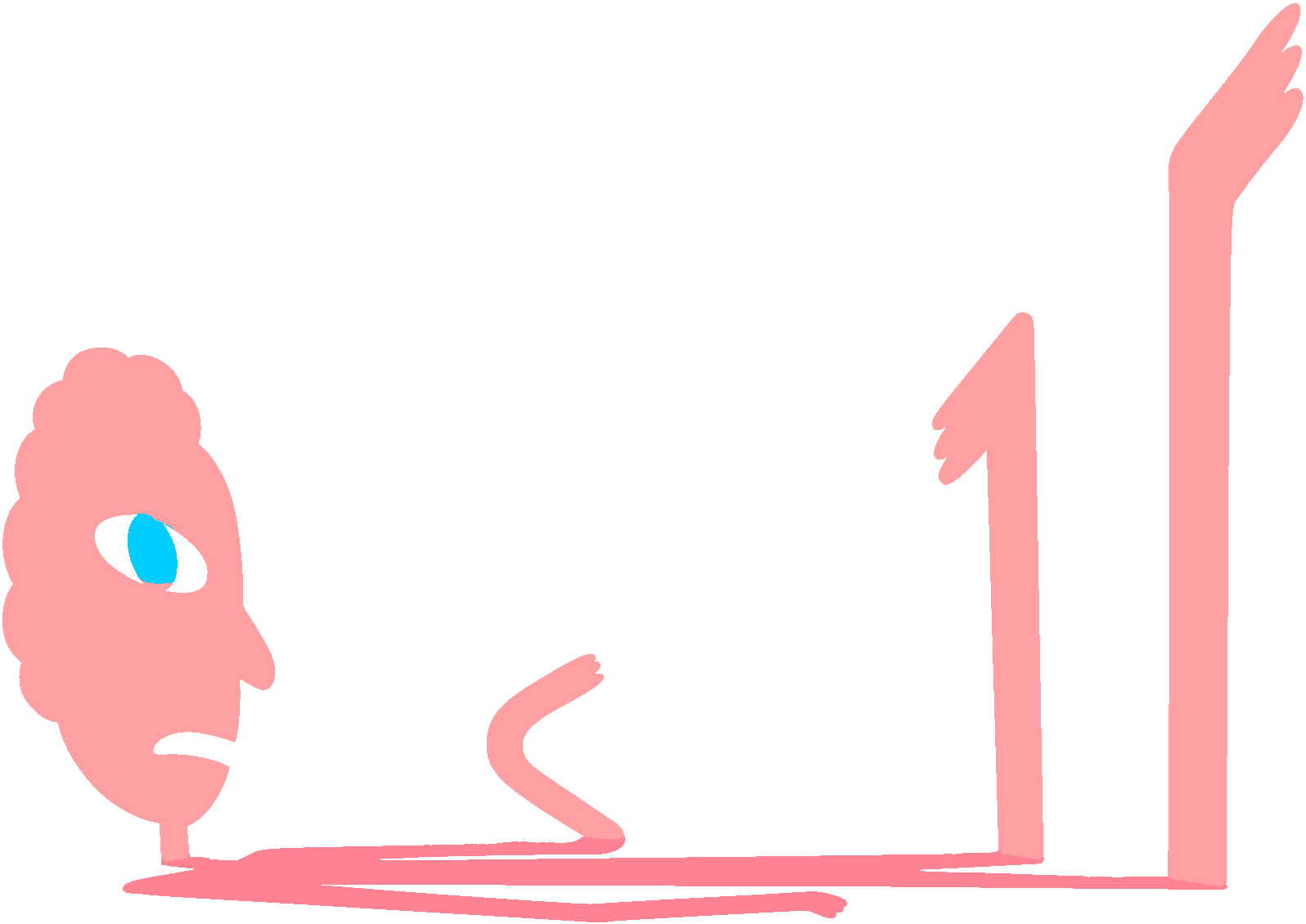
This looks half anime, half western junk. okay, i've done my share of anime, so here's some tips (if you want tips instead of a long, LONG message of non-constructive criticism): the entire figure is about usually like 5 - 7 heads high. the elbows don't curve, the bend SHARPLY. the hair just doesn't work. in some parts, it should come down to eye-level at least, specifically towards the sides of the head. also, ppl look REALLY bad if they have a big bald spot on the back of their head, and unless you change this to make the hair go all the way behind the neck, that's what will happen to him. the distance in between the fingers doesn't really change that much depending on what the character is doing, and doesn't enlarge towards the fingertips. on his left hand (your right), the front finger should be overlapping the one directly behind it, and the fingers on his right (your left) should be WAY closer. resort to overlapping the if you have to- in fact, do a little of it even if it's NOT a last resort. the natural position of the human hands includes fingers that are close together and slightly tilted. also, the cape is just WAY too wide. another thing is that you should JUST PICK A PERSPECTIVE ANGLE ALREADY!!!! either show more of the top of the shoes or more of the bottom of the head/arms/hands/legs. the shirt, also, need some adjustment with the design. the body is not completely flat, so the lines should not be strait, but curved. srsly, rent a drawing anime/manga from your library, or look up a tut (there are more tutorials online on manga than anime, last i checked. no offense, but you need the help. one last detail:the eyes. there should be two horizontal parallel lines for each eye, with first a shine/glint of light drawn (optional), then an ellipse (oval) for the iris, which is partially covered by the top of the eye (and sometimes the bottom), and finally the pupil, which should be overlapped by the top of the eye. to color the iris, use light strokes in a direction always facing the center of the pupil, assuming that you use a 2B pencil. using an HB pencil, as I have often done, use light to moderate pressure. remember the use of an outline/guidelines, and find a good manga tutorial.
Offline
#30 2011-06-29 15:03:09
- AnimeCreatorArtist
- Scratcher
- Registered: 2010-05-25
- Posts: 1000+
Re: My New Drawing...
maxskywalker wrote:
This looks half anime, half western junk. okay, i've done my share of anime, so here's some tips (if you want tips instead of a long, LONG message of non-constructive criticism): the entire figure is about usually like 5 - 7 heads high. the elbows don't curve, the bend SHARPLY. the hair just doesn't work. in some parts, it should come down to eye-level at least, specifically towards the sides of the head. also, ppl look REALLY bad if they have a big bald spot on the back of their head, and unless you change this to make the hair go all the way behind the neck, that's what will happen to him. the distance in between the fingers doesn't really change that much depending on what the character is doing, and doesn't enlarge towards the fingertips. on his left hand (your right), the front finger should be overlapping the one directly behind it, and the fingers on his right (your left) should be WAY closer. resort to overlapping the if you have to- in fact, do a little of it even if it's NOT a last resort. the natural position of the human hands includes fingers that are close together and slightly tilted. also, the cape is just WAY too wide. another thing is that you should JUST PICK A PERSPECTIVE ANGLE ALREADY!!!! either show more of the top of the shoes or more of the bottom of the head/arms/hands/legs. the shirt, also, need some adjustment with the design. the body is not completely flat, so the lines should not be strait, but curved. srsly, rent a drawing anime/manga from your library, or look up a tut (there are more tutorials online on manga than anime, last i checked. no offense, but you need the help. one last detail:the eyes. there should be two horizontal parallel lines for each eye, with first a shine/glint of light drawn (optional), then an ellipse (oval) for the iris, which is partially covered by the top of the eye (and sometimes the bottom), and finally the pupil, which should be overlapped by the top of the eye. to color the iris, use light strokes in a direction always facing the center of the pupil, assuming that you use a 2B pencil. using an HB pencil, as I have often done, use light to moderate pressure. remember the use of an outline/guidelines, and find a good manga tutorial.
Thanks for all the info and stuff, but i'm only 13, so cut me some slack. This is just a design. It's the first attempt to draw this character. And I'll learn as I go. I know there's some problems, but this is only a first attempt. I know i'll be getting better, So when I do, I'll have something else to post.
I'm basically honorary nasty. N-n-n-n-nasty jazz
Offline